I was recently interviewed on IndieView, and one question I was asked was whether I designed my own cover or not. I admitted that I had made a few failed attempts to create a cover for Life First before I turned to a professional. I also said I might show some of the failed covers in a blog post.
So, seeing as I’m particularly busy getting Second Life ready for its December release, I thought now would be a great time to do the failed covers blog post.
Part of the problem with me trying to design the cover was that I had no idea how to use the software or to layer the images, or even a good idea of what images to use, so my goal was to go simple. Here are the covers I considered before deciding I wasn’t a graphic artist and getting a professional.
So this is the very first cover I considered. It was bad, and I didn’t like it. I thought blue was the wrong color and while I can’t articulate all the reasons why, I just knew it didn’t work.

Next up, I got rid of the woman’s silhouette and tried just black and white. But I didn’t particularly like that either.

So, deciding I didn’t like the black-and-white, I tried for a red that approximated the color of fading blood. I thought that would be stark, yet still interesting.

I liked this concept better than the first two and played around with this one the most, with the following covers:


While I’d liked those concepts more, none felt like a hit, so I played around a little more with it, thinking I’d like the feeling of angled lines.

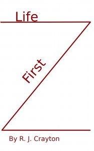
The angled lines formed a Z, which seemed out of place. But, I did like the idea of the angled lines, so I tried this one final thing, making the lines converge to form the L of Life First.

I think I ended up liking that cover best, but when all was said and done, I didn’t feel like any of the covers looked professional. So, I went out and got a professionally designed, pre-made cover. I think it’s for the best, but those were my attempts.
I think there are some authors out there who also have a graphic design background (or natural talent to figure it out) and can do their own covers, but I’m not one of them. And I did try (I checked out several cover design books from the library, but I didn’t feel I’d gotten the hang of it). So, for the authors out there, did any of you try to make your own covers? Did it work out well or poorly?
Oh yeah, tried my hand at cover design for my first book – just horrible! I may be able to craft words, but my attempts at cover art were laughable. Thank goodness for the genius of Colin Parks who saved me from myself. Your final cover for “Life First” is very intriguing – nice job!
Thanks, Kimba. BTW, I think your cover for “I was in love with a short man once” is great. Captures the title perfectly and makes you smile. All hail the professionals!
Cool to see the progression of the covers. The last cover idea looked very literary, kind of Catcher in the Rye or Slaughterhouse Five.
I’m always curious to see how cover designs come together.. I like the idea of creating them myself, but like you, I dot think I’d be the best one to do so.
Andrea, glad you enjoyed seeing the cover process. It was fun to share. Particularly glad you liked the last cover, as it was one of my favorites.
I agree that the third last one is best – but I’m glad you went for the pro cover. Many of the cover templates do not have enough scope to allow for some depth and complexity in the images. The results, as in these, are often too stark.
Yeah, I completely agree. I think it’s a steep learning curve for an author who is not versed in graphic design software, image procurement and font size and placement. Every author reads, so they’ve seen covers and can identify ones they like, but, in my opinion, it’s really hard to create a cover. So, I’m glad I tried doing it myself — because it’s gotten me some experience with GIMP software, but also because I now realizes covers are not that easy to do. And that always makes it easier to pay a professional for the service (when you realize it’s beyond your scope–or at least beyond the scope of what you have time to do).
Interestingly, I’m with Charles on this in terms of I think that the third last one is the best – although I have heard you should not use white as the base, but maybe a different color scheme could have worked.
I’m not at all artistic, but fortunately one of my nephew’s friends is an artist and he has designed the front cover of both my books and is currently working on book three – I’m really looking forward to seeing what he comes up.
Hmm, seems like the third to last one was the best of the bunch. It’s good you have a friend who’s able to do covers for you. Covers done well are crucial, so whatever way people can come by them is fine.
In answer to your question, though, I do my own covers, and it’s a mixed bag. Some are really quite good, and some suck. C’est la vie.
It’s nice to hear some people do their own covers and have good luck with them at times. And thanks for the compliment on the covers.
Actually, the third from the bottom (with the female figure) is a good one, except for the color. Something dramatic would improve it. None of them are all that bad, except for the rather undramatic color scheme.